The Remai Modern art gallery has unveiled its logo.
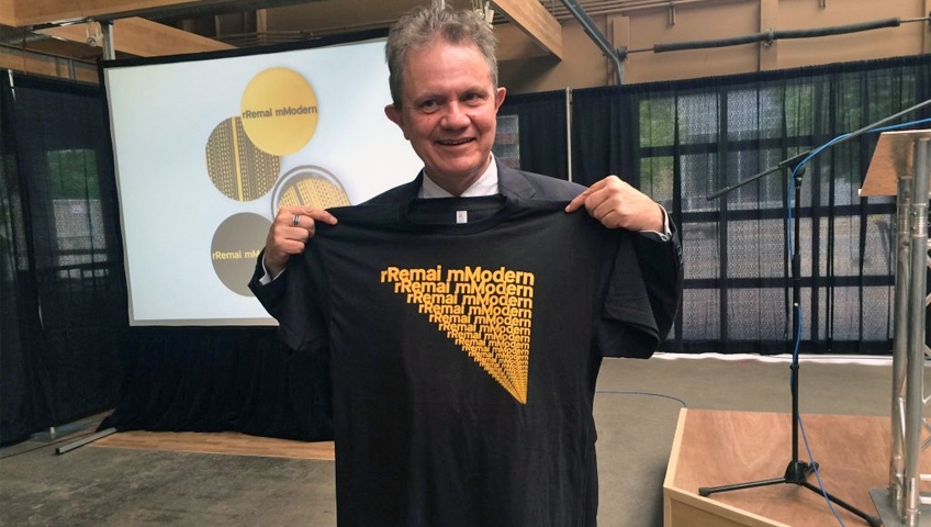
The gallery presented its branding at the Saskatoon Farmers’ Market Tuesday.
It’s “very strong but modest at the same time,” Gregory Burke, executive director and CEO of the gallery, said of the branding.
The logo, in simple font, features a lower case “r” in front of the word “Remai” and a lowercase “m” in front of “Modern.”
New York designers karlssonwilker created the logo. The design duo has worked with MTV, Mini and TIME magazine.
Burke described the Remai Modern logo — specifically its use of upper- and lower-case letters — as uniquely Canadian.
“These playful additions are intended to emphasize our willingness to be bold and to ask questions, including questions about our own identity,” he said. The dark colour represents Saskatchewan’s soil and minerals, while the yellow represents sun and harvests.
As part of the launch, the gallery will debut a commissioned piece on their website every month, starting June 1.
Also unveiled was Remai Modern’s summer program, “Three Seeds and a Hen’s Tooth.”
The three-part exhibit will feature work from a trio of Saskatchewan artists. The gallery says the project will focus on themes such as ecology, local production and sustenance.
The Remai facility is slated to open in 2017. The museum comes at a price tag of $84.6 million
